Radical Fix for WPF Menus
Why New Menus?
Usage
Basic Usage
Customization
Nicety Properties
Interesting Implementation Details
Uniform Property Set
XAML Data to Code
Interactive Properties Cheat Sheet
The new WPF menu controls replace WPF System.Windows.Controls.Menu and System.Windows.Controls.ContextMenu. Why is this required?
Well, because the default WPF menu design is a spectacular failure:
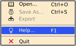
The menu controls SA.Agnostic.UI.Controls.Menu and SA.Agnostic.UI.Controls.ContextMenu fix all those problems and are developed from scratch. Moreover, they expose essential inner content stylistic properties, so the developer won’t need to develop control templates.
Reference the project Agnostic.UI.Controls.csproj or the assembly Agnostic.UI.Controls and use the menu classes in XAML:
<Window x:Class="WindowMain"
        xmlns="http://schemas.microsoft.com/winfx/2006/xaml/presentation"
        xmlns:controls="clr-namespace:SA.Agnostic.UI.Controls;assembly=Agnostic.UI.Controls"
        xmlns:x="http://schemas.microsoft.com/winfx/2006/xaml">

    <Window.ContextMenu>
        <controls:ContextMenu>
            <MenuItem Header="Open..." Icon="⚽"/>
            <MenuItem Header="Save" Command="ApplicationCommands.Save" Icon="💰"/>
            <!-- ... -->
        </controls:ContextMenu>
    </Window.ContextMenu>

    <Grid>
        <Grid.RowDefinitions>
            <RowDefinition Height="auto"/>
            <!-- ... -->
        </Grid.RowDefinitions>
        <controls:Menu>
            <MenuItem Header="_File">
                <MenuItem Header="Open... " Icon="🕮"/>
                <MenuItem Header="Save" Command="ApplicationCommands.Save" Icon="💰"/>
            </MenuItem>
            <!-- ... -->
        </controls:Menu>
        <!-- ... -->
    </Grid>

</Window>
To customize the inner content stylistic properties of the menus, add a new Nicety instance. It will inherit the default set of dependency properties. Override some of them to modify styling. Use the interactive properties cheat sheet for reference.
<Window x:Class="WindowMain"
        xmlns="http://schemas.microsoft.com/winfx/2006/xaml/presentation"
        xmlns:controls="clr-namespace:SA.Agnostic.UI.Controls;assembly=Agnostic.UI.Controls"
        xmlns:x="http://schemas.microsoft.com/winfx/2006/xaml">

    <Window.ContextMenu>
        <controls:ContextMenu FontSize="20" Background="LightYellow">
            <controls:ContextMenu.Nicety>
                <controls:Nicety
                    CornerRadius="5.3"
                    SeparatorVerticalGap="4"
                    BackgroundNormal="LightYellow"
                    BackgroundHighlight="LightGreen"/>
            </controls:ContextMenu.Nicety>
            <MenuItem Header="Open..." Icon="⚽"/>
            <MenuItem Header="Save" Command="ApplicationCommands.Save" Icon="🚑"/>
            <MenuItem Header="Save As..."/>
            <Separator/>
            <MenuItem Header="Help">
                <MenuItem Header="Submenu 1" Icon="🎲"/>
                <MenuItem Header="Submenu 2"/>
            </MenuItem>
        </controls:ContextMenu>
    </Window.ContextMenu>

    <!-- ... -->

</Window>
Nicety is the dependency property defined for both Menu and ContextMenu used to customize inner menu stylistic elements.
Menu Item Icon Properties
MarginIcon: margins around a menu item icon.
ForegroundIconNormal: menu item icon foreground.
ForegroundIconHighlight: highlighted menu item icon foreground.
ForegroundIconDisabled: disabled menu item icon foreground.
IconAlignmentHorizontal: menu item icon alignment of the type System.Windows.HorizontalAlignment.
IconAlignmentVertical: menu item icon alignment of the type System.Windows.VerticalAlignment.
Notes:
ContextMenu have different sizes.Menu Item Header Properties
MarginHeader: margins around a menu item header text.
ForegroundHeaderNormal: menu item header foreground.
ForegroundHeaderHighlight: highlighted menu item header foreground.
ForegroundHeaderDisabled: disabled menu item header foreground.
Menu Item Gesture Indicator Properties
MarginGesture: margins around a menu item gesture indicator text.
ForegroundGestureNormal: menu item gesture indicator text foreground.
ForegroundGestureHighlight: highlighted menu item gesture indicator text foreground.
ForegroundGestureDisabled: disabled menu item gesture indicator text foreground.
Background Properties
BackgroundNormal: menu item background.
BackgroundHighlight: highlighted menu item background.
Note: BackgroundNormal and the menu property Background can define different brushes. However, this is not recommended for most cases. Even though the menu items can cover the entire area of a ContextMenu, this is not the case if SeparatorVerticalGap is non-zero or CornerRadius is non-zero, because the menu background shows through the non-rendered areas.
Separator Properties
SeparatorThickness: defines the Separator thickness.
SeparatorVerticalGap: defines the Separator margin symmetrically;
this is a double property used as the Top and Bottom properties for the Separator margin.
Line Properties
LineBrush: defines the same brush for the Separator and submenu or ContextMenu border.
CornerRadius: defines the same corner radius for the menu item and submenu or ContextMenu border.
BorderThickness: defines the thickness for the submenu or ContextMenu border.
One reason for the Nicely implementation is the lack of multiple inheritance. Two menu classes, SA.Agnostic.UI.Controls.Menu and SA.Agnostic.UI.Controls.ContextMenu, require the identical set of properties exposed to the developer using these classes. Some of those properties are used for the two classes in different ways.
To provide proper reuse, these menu classes add a Nicely property of the same class. Its implementation is based on the Resources of both menu classes. The set of resources is also reused in both classes through composition.
The styles and control templates used by both menu classes are defined in the same XAML.
To reuse resources between two menu classes, they are implemented in a special class, ResourceHost. The Nicely class merges the resources from ResourceHost into Resources.MergedDictionaries of each menu class.
Also, the same XAML is used to define the default set for Nicely dependency properties.
The class ResourceHost is derived from System.Windows.Freezable. This is the minimal class suitable for storing and exposing resources. In contrast to the direct use of XAML resource files, it provides a technique of accessing resources without any magic strings usually used as dictionary keys. It allows for storing and retrieving arbitrary structured data classes in XAML.
See also:
Click on property names for detailed information: